| Prev | ICM User's Guide 19.3 Plotting Table Data | Next |
[ Histogram | Histogram Options | Bins | Two Columns | Title | Axis Option | Change Axis | Logarithmic | Mark Shape and Size | Mark Color | Grid and Axis | Least Squares Fitting | Zoom, Translate and Center | Plot Selection | Print | Save | Table Inline Plots ]
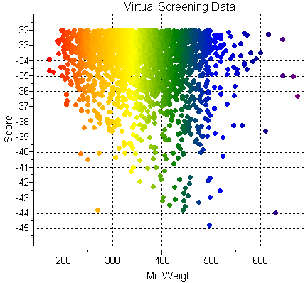
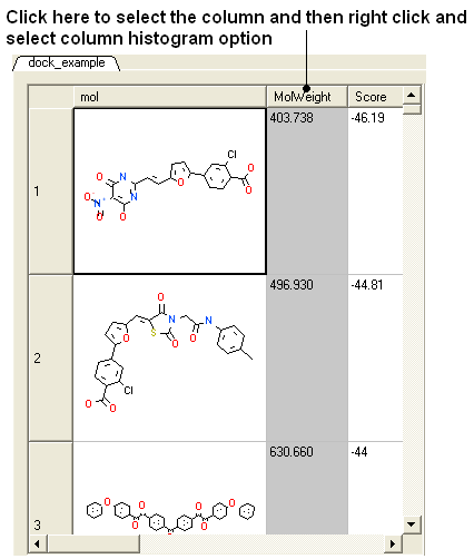
The data within a table can be plotted graphically. A histogram can be made for the data within one column or a plot can be constructed for the data within two columns.
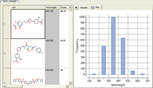
19.3.1 Column Histogram |
To plot a histogram of the data within one column:
- Select the column by clicking on the column header.
- Right click on the column header.
- Select the Column histogram option.
A plot will then be displayed next to the table.
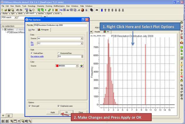
19.3.2 Histogram Options |
Once you have created a histogram you can change the following parameters by right clicking on the plot and selecting options
Options:
- Change plot title.
- Change the data source using the drop down button and select another column in the table.
- Change the histogram bin size.
- Change the bars positioning from vertical to horizontal.
- Change the bar relative width compared to bin size. Bigger values give thicker bars.
- Color the bars
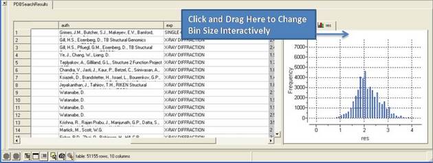
19.3.3 Histogram Bins |
There are two ways to change the bin size. 1. Using the options dialog box or 2. interactively by left clicking and dragging at the top of the plot as shown below - this will allow you to find the best density estimation picture.
19.3.4 Plotting two columns |
To construct a plot from data within two columns:
- Select the two columns.
- Right click on the column header.
- Select the Columns plot option.
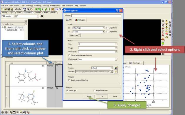
19.3.5 Add a title to a plot |
To add a title to a plot:
- Right click on the plot and select Edit Title or choose Options
19.3.6 Axis Options |
Each axis has a set of options which can be accessed by right clicking on the axis and selecting Options.
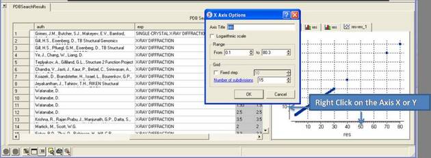
To change the title of the X or Y Axis:
- Right click on the axis and select options
To change the data range:
- Right click on the axis and select options
- Change the From and to values in the Range box
To change the Grid steps (ticks) on the X or Y axis:
- Select either a fixed step e.g. 10 and you can define the number of subdivisions (ticks) in each step. Choosing 1 will display zero ticks between divisions.
To change the axis to logarithmic
- Right click on the axis and select options
- Select the Logarithmic scale check box
19.3.7 Change Axis Data |
To swap the X and Y axis:
- Right click on the plot and select Options.
- Select the Swap X and Y button.
- Click OK.
To change the data source for either the X or Y axis:
- Right click on the plot and select Options.
- Select the drop down arrow as shown below and select a different column from the table.
- Click OK.
19.3.8 Logarithmic Plots |
To change the scale of the axis to logaritmic:
- Right click on the plot and select Options.
- Select the Logarithmic check box.
19.3.9 Change Mark Shape or Size |
To change the plot mark, shape, style or label:
- Right click on the plot and select Options.
- Select the desired size and shape using the drop-down buttons in the Marks section of the window.
To add point labels:
- Right click on the plot and select Options.
- Select the drop down arrow in the Point labels dialog box
- If you only want to label selected points check the Show labels for selection only option. Making plot selections is described here.
19.3.10 Change Mark Color |
To change the color of the plot marks:
- Right click on the plot and select Options.
- In the Color section of the window select the Source (column name plotted as X or Y) you wish to color.
- Select the color palette and choose the desired color or you can choose a Gradient of colors.
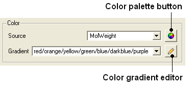
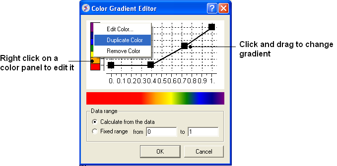
To edit the color gradient
- Click on the Color gradient editor button and a window as shown below will be displayed.
- Click and drag on a mark in the gradient plot to change the color gradient.
- Right click on a color in the Y-axis to - Edit, Duplicate or Remove Color.
- The color gradient can be applied to all points in the data or for a fixed range.
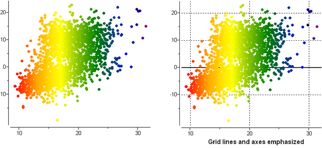
19.3.11 Grid and Axis Display |
To remove the grid display and/or highlight the axes:
- Right click on the plot and select Options.
- Check the Show grid or Emphasize axes options.
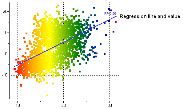
19.3.12 Least Squares Fitting |
To fit the data to a straight line using least square fitting
- Right click on the plot and select Options.
- Select the check box for Least squares fitting line.
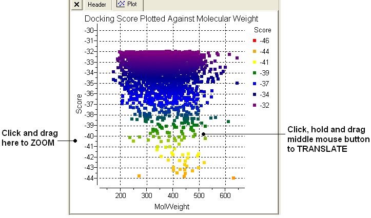
19.3.13 Zoom, Translate and Center |
To zoom into a plot:
- Click outside the plot on the left-hand-side and drag the mouse or use the middle mouse wheel to zoom in and out.
To translate a plot
- Click, hold and drag using the middle mouse button on the plot.
To center onto a plot
- Right click on the plot and select Center all or Center Selection. Making selections in a plot is described in the next section.
To center into an axis
- Right click on the axis and select center.
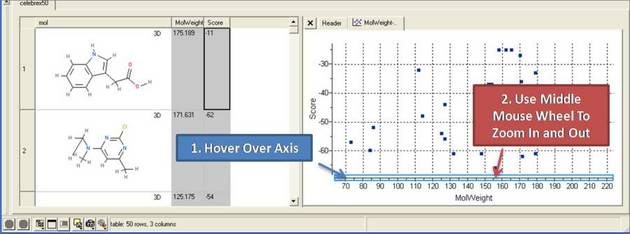
To zoom into an axis
- Hover the mouse over the axis until you see a blue rectangle surrounding the axis.
- User the middle mouse wheel to zoom in and out as shown below.
19.3.14 Plot Selection |
To make a selection in a plot:
- Click and drag in the plot to make a selection. Individual points can be selected with a single click.
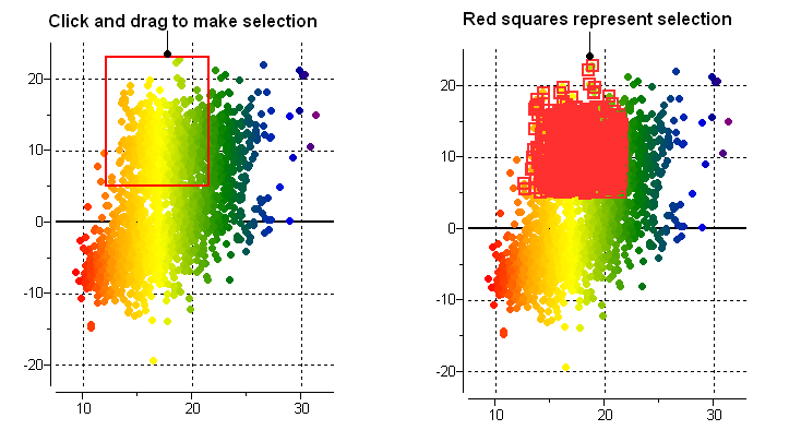
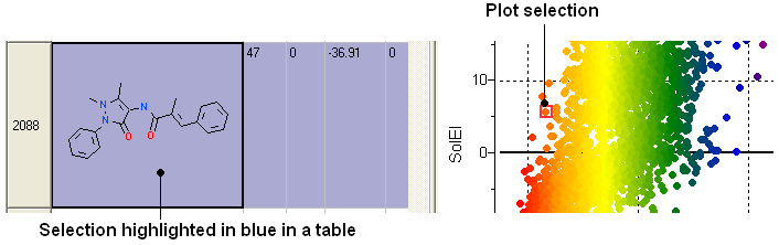
All selections are directly linked to the table from which the plot was made. Selections in the table are highlighted in blue.
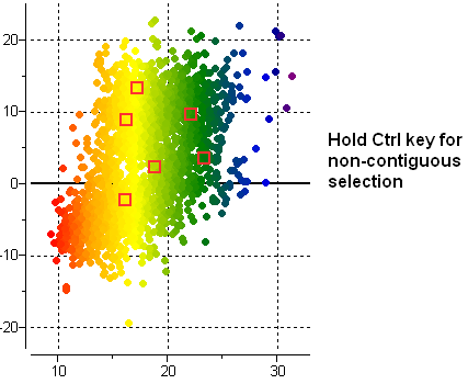
Non-contiguous selections in the plot can be made by holding the CTRL key.
19.3.15 Print Plot |
To print a plot:
- Right click on the plot and a menu will be displayed.
- Select the print option.
19.3.16 Saving a Plot Image |
To save a plot image or copy to clipboard:
- Right click on the plot and a menu will be displayed.
- Select the Save/Export Image option.
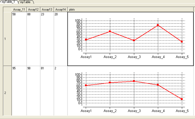
19.3.17 Table Inline Plots |
Plots can be inserted into a table row by:
- Select the columns you wish to plot.
- Right click on the column header and select Inline Plots
- The plot will then be displayed in each row of the table.
| Prev Molecular Tables | Home Up | Next PCA |